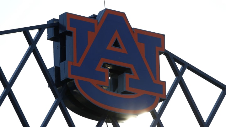
Auburn Has a New Logo That They Claim is Totally Not a New Logo
By Ryan Giglio

When brands have a new logo, they are usually excited to promote it and usher in a new era.
So why is Auburn University so adamant about not having changed its logo?
On Thursday, Brandon Marcello of Auburn Undercover reported the changes to the university's "shield" logo. The changes included a shorter "U" and less white space between the two letters.
If you missed it last night: #Auburn has changed its logo https://t.co/xzaUAKygFR
— Brandon Marcello (@bmarcello) August 9, 2019
However, on Friday, Auburn University told Marcello that his article regarding the change was "inaccurate" and that the altered logo should not be considered "new."
Auburn University reached out to tell me it's "inaccurate" to report they have a "new logo." This is the communications team's explanation for what they say is not a new logo. pic.twitter.com/eSMi4d6vHQ
— Brandon Marcello (@bmarcello) August 9, 2019
Auburn's assistant vice president of communications Mike Clardy said that this was not a new logo. Instead, "Auburn updated its visual identity system..."
Clardy further explains that the change was made to make the logo more digitally compatible and help expand the Auburn brand.
Here's a handy graphic of the new logo on the Auburn helmet compared to the old/current pic.twitter.com/unkfIq6mAs
— Clint Richardson (@Clintau24) August 9, 2019
The alterations are very small, and arguably the biggest change to the logo in over 20 years. But that doesn't change the fact that the logo is... new.
Some Auburn fans on twitter are not happy with change, so maybe the university's hesitancy to call the updated logo "new" stems from that group.